

I have been having a look at Drupal sites to find out what innovative designers are doing with Drupal. Unfortunately I have to say that I haven’t seen may efforts to produce visually interesting sites. Thats probably why most people don’t like Drupal, because it is ugly. I would say that more than simply ugly sites, Drupal sites tend to end up being too cluttered, full of modules and information, ending up looking like magazines. This make it impossible to read or find whatever you are looking for, this is because on a clutter of text where every piece has the same weight it is impossible for the user to scan the page.
Everyone knows that most of the times that you chose a Drupal CMS to host some sort of community, you do it because it is easy to install, you don’t need to worry about the design because you can use one of the free themes and above all, it works.
It is clear that there are limitations to the design, but there are workarounds and there are plenty of ways to use the limitations in your advantage to make the site look different.
The first site I would like to comment on is Apart From War this is a great example on how jquery can enhance the look and feel of a Drupal website and make it standout.
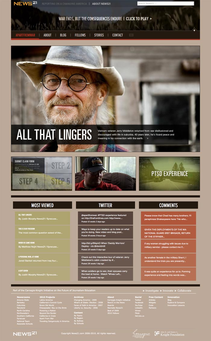 Screenshot of the Apart From War Site
Another site I wanted to show you in here is We Are Frost Fire This is a good example on how commercial sites can use Drupal to produce a site that don’t look like Drupal. Very clean site with good call to action, very well made.
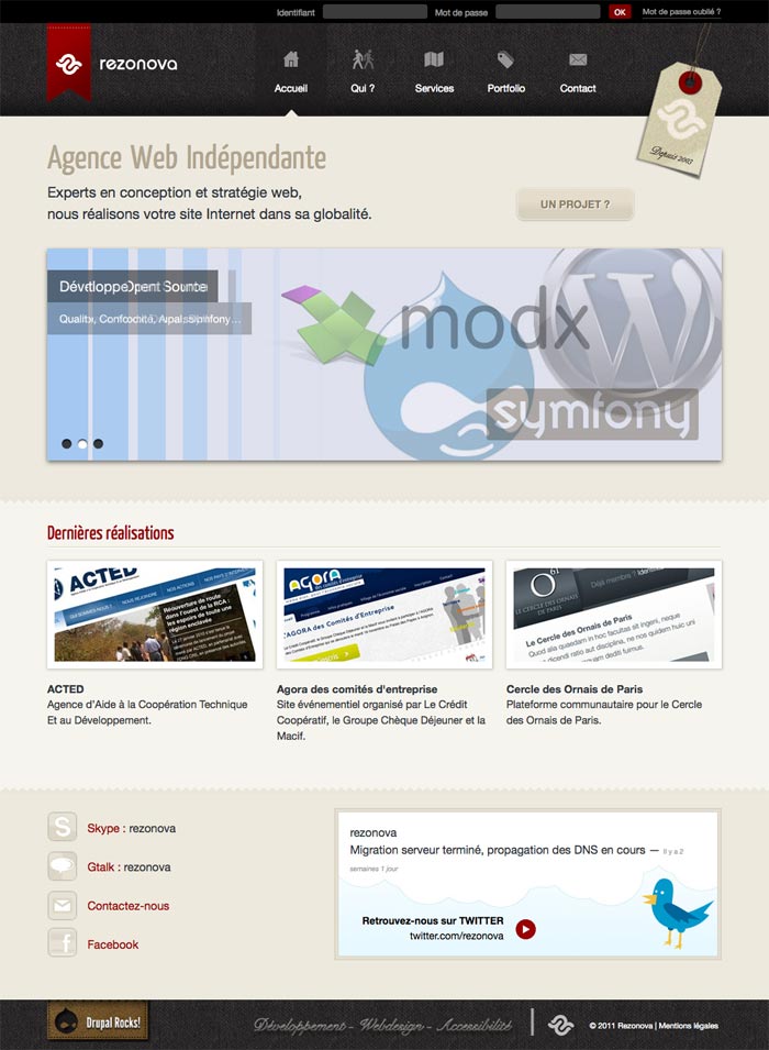
![]() Screenshot of the site We are Frost Fire Next site I wanted to show you is Rezanova A very modern-looking site that uses well the integration of background textures in the design. I like the integration of tweeter and social sites, as well as the use of icons for the navigation. A very solid design.
Screenshot of the site We are Frost Fire Next site I wanted to show you is Rezanova A very modern-looking site that uses well the integration of background textures in the design. I like the integration of tweeter and social sites, as well as the use of icons for the navigation. A very solid design.
 Screenshot of the site RezonovaLast example I wanted to show here was the website from the Philadelphia Old City District. This site looks more like a regular Drupal site, but there is some design efforts that I find interesting. First of all an original top menu (I am not too fond of it, but it is original), then I like the weather forecast on the top side, I agree that if you want to check a site for events in a specific area, having a weather forecast is a very welcomed feature. The rest of the site could use some more consistency among elements, this is a common problem in Drupal sites, even when there is not too much information, the modules look cluttered like here because the dimensions don’t match. Overall, a very interesting effort and with some more work this could be a very good Drupal site.
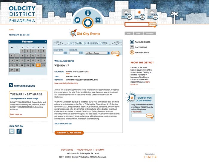 Screenshot of the Philadelphia Old City DistrictAs I said at the beginning, it is not easy to find interesting Drupal designs, but there are some, of course. I will keep browsing the web and I will show here some more examples in the future.
Recent Comments