
Modern web design has been focusing on simplification. We spend many hours every day, every week, on the internet. We check for dry cleaners online, chinese restaurants, we research possible partners and so on. The first impression we receive from the company we want to know is very important, how many times you entered a site, puked and look for something else. The idea of this post is trying to have the users not to puke when they see your site for the first time.
I am going to give you a very simple example of a portfolio site, something clean and engaging. I have decided to divide this post into two parts, in this first part we will see the elements that the users will se “above the fold”. This will be the first impression of the user in your site so we need to have our ideas very clear.
First thing when designing a home page (as well as any other page on a website) we need to have very clear what is our target audience and what do we want them to do in our site. For this example, we are going to consider that we have a personal (or small agency) portfolio site.
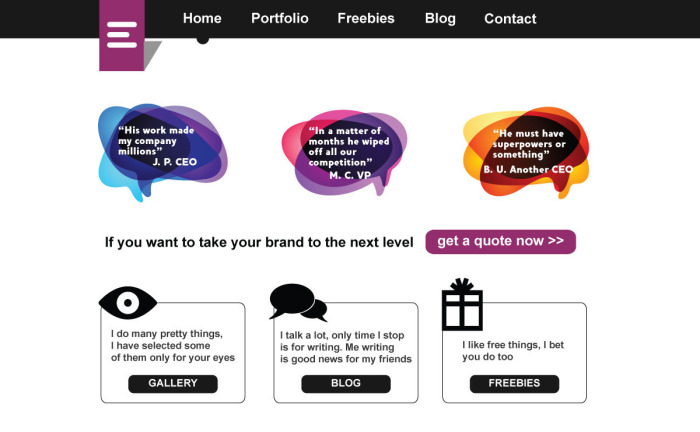
I have segmented the users into two groups. One group, the smaller, but for me the most important, clients. Yes, this website will measure the success if we get our clients to the goal we have design for the site, have them to contact us for a quote. As you can see, the main button and principal call to action is the violet button in a prominent position. The color makes the button have the most contrast on the site and we drag the user attention to it. “If you are a possible client I want you to see it”.
My second group will be users of the site in general, other designer that want to see what am I showing on my gallery, writing about, or to get some freebies (freebies are always a good way to drive traffic to the site). To make this second group happy we have prepared three elements under the main block, I know this links we have them already on the top menu, but in my experience, users will click on the modules 70% more of the times.
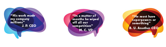
This way we have prepare an easy to read, segmented home page for my two target groups. One quick note about the main module, the use of quotes is generally a good idea if done right. Quotes have to be believable, with a full name and position of the person as well as name of the company, to make it perfect, use a picture (all of that is wrong in my example though). It is proven that quotes will improve the trust on your company’s services and since my main goal is having clients to contact me for a quote, I need to support their decision of clicking the button with some facts.
Special thanks to the people of the noun project for the cool icons.
Recent Comments