Everyone knows there are differences between art directors and designers, but not many people are able to tell what those differences are. Managers and stakeholders usually say, art directors are expensive and designers cheap, if the designers can get the job done, is it worthy to pay the extra money?
Very human reasoning here, of course. Most of the time the idea is that art directors are basically experienced designers and thats it.
The role of art directors is to give clarity to the designer. To understand the briefing, target group, understand the project as a whole. Is this color appropriate for the clients? or is there because is looks “good” on the design. Do we need a fresh and exciting design for a company with corporate branding? The designers job is to do the work on Illustrator, Photoshop or whatever and the art directors role is to help the designer follow the correct guidelines in order to produce a successful design.
The art director can be a good designer, and even though he/she doesn’t necessarily need to be a good designer, he/she should be knowledgeable of the design principles. Some smaller agencies do not have art directors and do the the art direction with a experienced designer (art direction is a part of the process that can’t be skipped), and some bigger agencies use the art director position as an improvement carrier for experienced designers, therefore turning designers into art directors and shading even more the conceptual difference between both profiles responsibilities.
Good art directors make better designers. They are good listeners and open to accept the designer’s point of view even when the designer comes up with something different than what the art director had in mind (if the design is successful, of course).
I want to have a look at a couple of examples:
First, the DVD cover from the Eternal Sunshine Of The Spotless Mind:
 Via www.movieposterdb.com
The art direction here is wrong, misleading. It gives you the feel that you are going to rent a movie that it is not.
This other version, fits better the eerie mood of the movie:
 Via IMDB
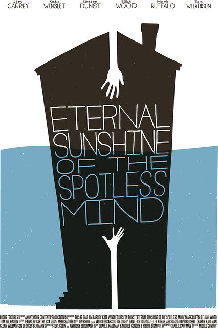
I wanted to have a look at an example of beautiful design but wrong art direction. This excellent conceptual poster by Ross McCampbell. The Saul Bass style is always attractive and gives the design a very clean and retro feel that definitively doesn’t apply to the theme and style of this movie.
 Artwork on Flickr by Ross McCampbell
A second example I wanted to show is the NASA logo.
The guys at Logo Design Love don’t like the design of the current NASA logo (who blames them) and they wanted to offer a redesign. If you read the article, you can see that while the design of the original logo is bad, and the redesign is very good (I actually like it a lot), the art direction on the original is good, correct colors and elements and the redesign is not so successful, there are no correct colors or elements, even though it is a much better design, most likely NASA would have never accepted the art direction here.
I could go on but you get the point. A very good article on Art direction and design of Dan Mall can be found at A list Apart.


Recent Comments